Program Imagery and Character Recommendations
Imagery and language work together within a program to create a unique experience that gets a user's attention, conveys a message, and elicits an emotional response. We recommend using these elements to help users understand their progress within a program.
Nitro supports emojis in mission descriptions, tasks, and other text fields. Quizzes only support unicode emojis that are 3 bytes or smaller.
The following recommendations help display images appropriately and eliminate word wrapping and truncation. In a customized program, sizing and character limits can be adjusted to fit your design.
Note: Blocks use Roboto as the default font. Other supported fonts vary based on browser, operating system, and theme.
Blocks
|
Element |
Recommended Size |
Use |
|---|---|---|
|
Imagery |
||
|
Badge and level icon |
400x400px (max file size of 500KB) Supports PNG, JPG, JPEG, and GIF. |
Badges and level icons display in At a Glance, the trophy case, and the mission detail view. |
|
User/Profile image |
400x400px (max file size of 500KB) Supports PNG, JPEG, and GIF when added via Nitro Studio. Supports PNG and JPEG when added via the block. |
The user image displays in the user's profile, leaderboards, and recognition. |
|
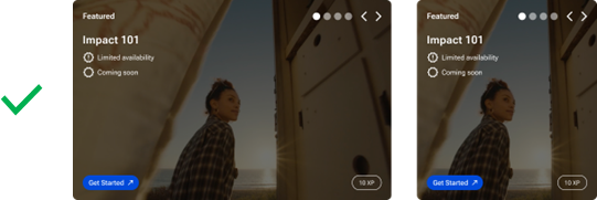
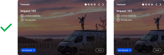
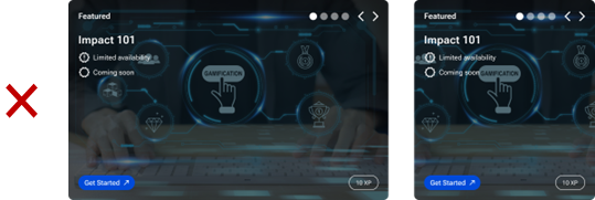
Mission background image and Default Featured Mission image |
2000x2000px is the recommended minimum for an image to appear sharp on HD displays. Typically, a 16:10 ratio with the image centered compositionally is acceptable. (max file size of 1MB) Click the image to see an example
|
The background image displays in the mission tile. If no background image is set, a gradient displays that can be styled to your brand standards. If you have no featured missions available, a default image and description can be set to display in the Featured section until a featured mission becomes available. |
|
Point category icons |
60x60px (max size 500KB) Use a minimalistic design in a color that displays best on mission tiles with background images and without. In most cases, a white icon is preferred unless you're using very light colors in the gradient background. |
Point category information displays throughout Impact in the following order:
|
|
Earned rewards image |
350x350px |
The image that displays in the Mission Complete pane showing the rewards earned for completing the mission. The default image is stars. |
|
Group image |
400x400px (max file size of 500KB) |
A personalized group image displays with the group name in leaderboards. The image is set in the group's properties. |
|
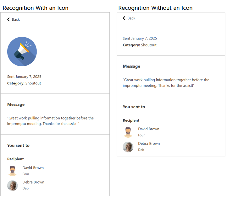
Recognition category icons |
400x400px (max file size of 500KB) |
If used, the category icon shows in the recognition detail. Click the image to see an example
|
|
Text Elements |
||
|
Mission name and description |
|
Names and descriptions display on the mission tile. The mission name displays in the trophy case. Names and descriptions tell users about a mission and what they should do to complete it. Short, but informative descriptions are recommended. |
|
Level name and description |
|
Level names indicate how users are progressing through the program. Descriptions only appear to administrators in Nitro Studio. |
|
Rule descriptions |
40 characters or less |
Rule descriptions describe the task the user must complete. |
|
Point category name |
10-15 characters |
Point category information displays throughout Impact in the following order:
In the Impact mission detail view, the point category truncates at 6 characters. Using a short name is highly recommended. |
|
Point category short name |
3-5 characters |
The short name displays when no point category icon is set. |
|
Quiz questions and answers |
|
Quiz questions and answers display best when using short, descriptive text. If your answers are longer, consider having fewer answers. For example, if your answers have 15 characters, you can have 5 answers. If your answers have 150 characters, you can have 3 answers. |
|
Recognition category name |
14 characters or less |
The name displays to the user with the recognition they send/receive. |
|
User name |
|
A user name personalizes the greeting, leaderboard, and other areas in the program. |
Impact+
|
Element |
Recommended Size |
Use |
|---|---|---|
|
Imagery |
||
|
Program and brand logo |
minimum height of 100px (max file size of 1MG) Supports PNG, JPG, JPEG, WEBP, and AVIF. |
The images to display as your company and program logos. The header and footer can each display one, two, or no images. |
|
Text Elements |
||
|
Header and footer link names |
15 characters or less |
The text to display in the header and footer for static content links. Short but informative names are recommended. |
|
Trademark |
50 characters or less |
The trademark text to display in the footer. |
See also